Film Art and Packaging
In wanting to add a personal touch to my physical media collection, I have designed variant cover art for some of my favorite movies whose packaging required a cosmetic overhaul. (If they’re going to collect dust on my shelves, I want them to look good doing it.) Here’s my process and my work so far in what I like to call The BA Variant Series.


The Cover Art
When designing posters and covers, I focus on themes and imagery from the movie that evoke the appropriate mood. Of course, the cover art is meant to sell the movie, too, so eye appeal and shelf visibility cannot be overlooked. It takes several viewings and dozens of (very) rough sketches to distill my ideas into a cohesive vision.
Example: Here is my artwork for the 2017 anthology horror movie Ghost Stories. Inspired by a specific scene in the latter half of the film, the artwork not only embodies the themes of grief and loss at the heart of the movie but evokes a sense of eerieness representative of the film’s horror leanings. The illustrative black-and-white artwork - inspired by the poster art of the 1970s-era movies from which Ghost Stories takes inspiration - is eye-catching and stands out on the shelf.


The Formatting
The information typically found on the back of a film’s packaging is both important and superfluous. I retained what I consider to be essential - production credits, plot description, technical specs, and company logos - and did away with the promotional critic quotes, arbitrarily chosen still frames, and all the legalese (since this is just for fun, after all). The information hierarchy and formatting is (mostly) uniform across all projects, taking inspiration from boutique labels such as Arrow Video and Criterion Collection.


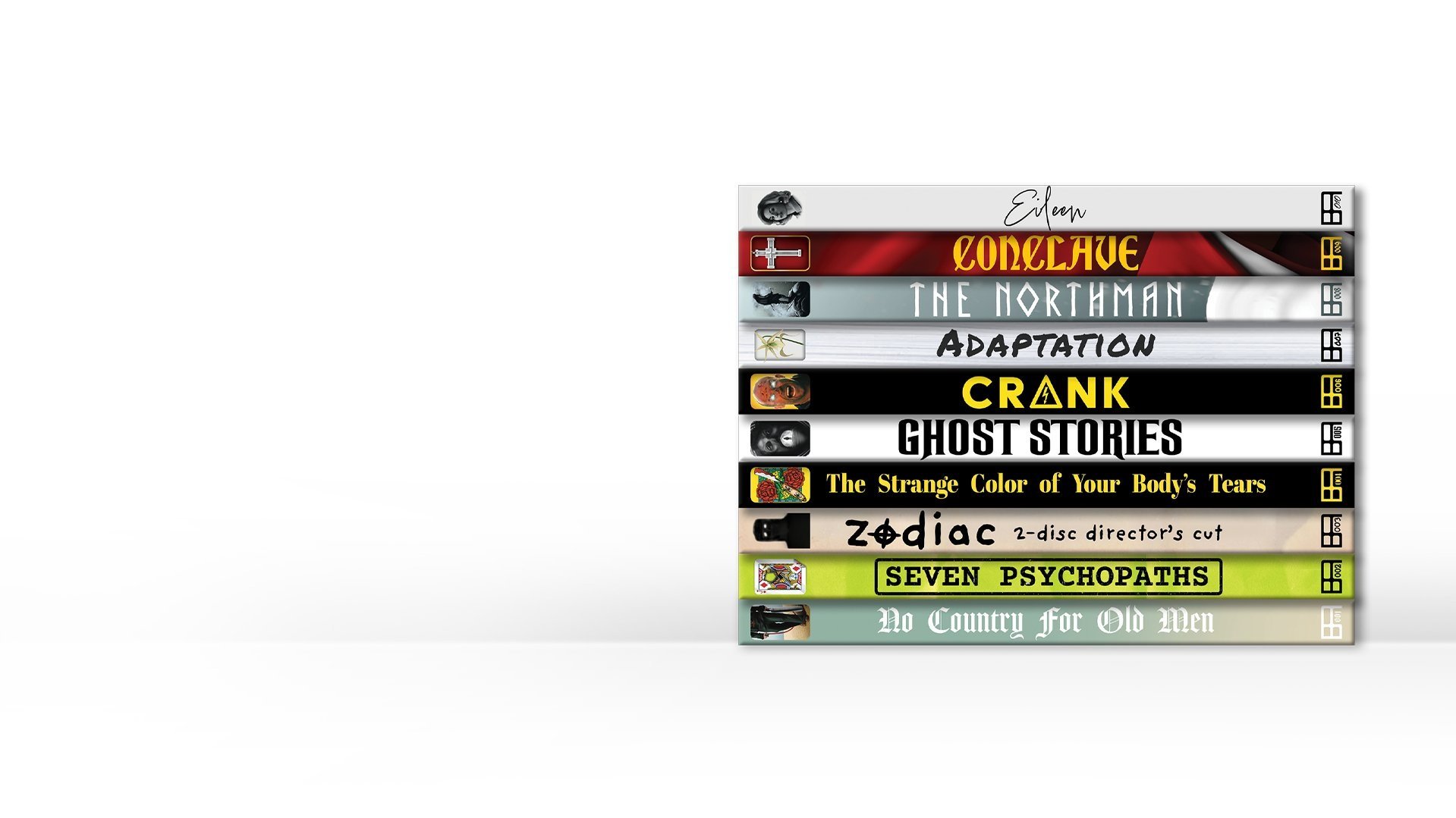
The Logo and Spine Art
My favorite distribution labels have their own logos: Second Sight, Criterion Collection, Vinegar Syndrome. So I thought it appropriate to design my own. Stamped at the bottom of every spine is the logo I designed myself and in it, the number of the release.
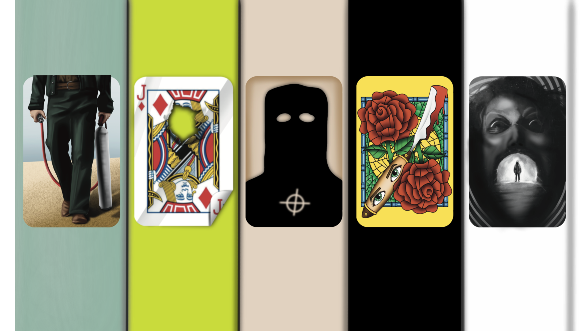
Only the spines are visible on the shelf, so I created a smaller piece of art for the top of the spines. Together the logo and spine art create a sense of uniformity across all “releases” while also maintaining my own personal touch.


The Packaging
Finally, we have the packaging and materials. Most slipcovers you find in stores are made of semi-thick cardstock. For my specialty covers, I opted for a heavier 100 lb. paperweight, lending a thickness and weight to the packaging that most are lacking. The folds along the top and bottom allow for uniform color gradation when assembled, and scoring along the vertical folds helps to prevent tearing.
To finish, a couple layers of enamel is sprayed to give the final packaging a glossy, smooth finish.


Thanks for Visiting!
This is an ongoing project that I hope to continue and grow, so stay tuned for more coming soon!